BAUHAUS 100
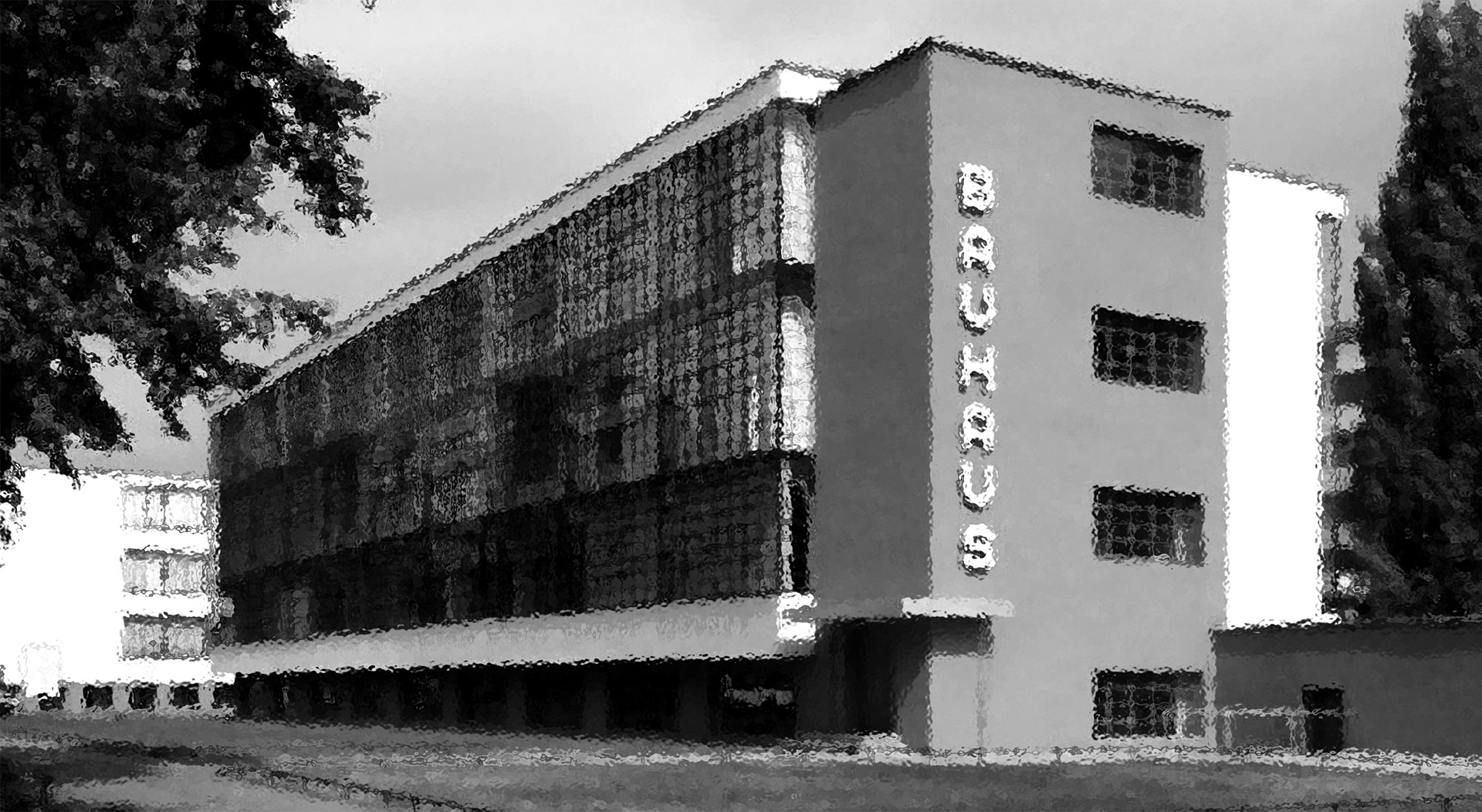
In the year of 2019 Bauhaus Design School turned 100 years old. To acknowledge this, The Danish Museum of Design had an exhibition on the theme where they showed off chairs, sketches, toys, colours and furniture. To commemorate the legacy of Bauhaus, I designed posters. Brief: design two posters; one in colour, and one in black-and-white.
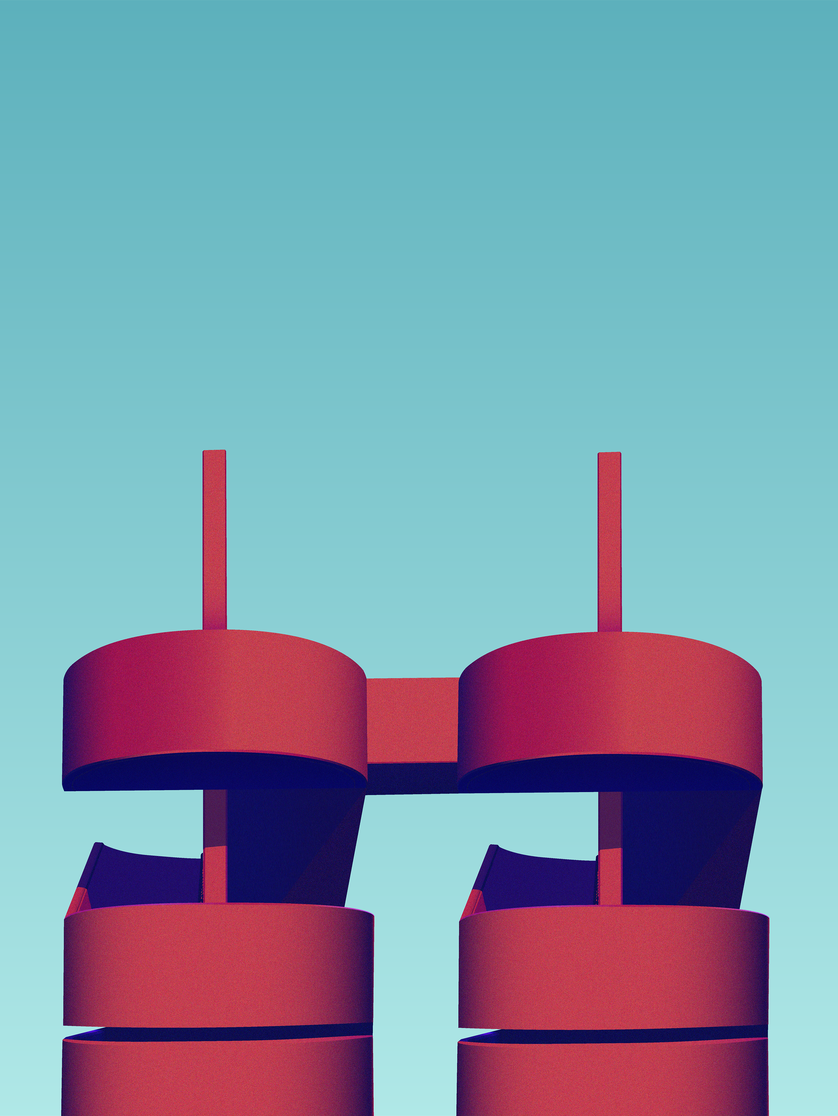
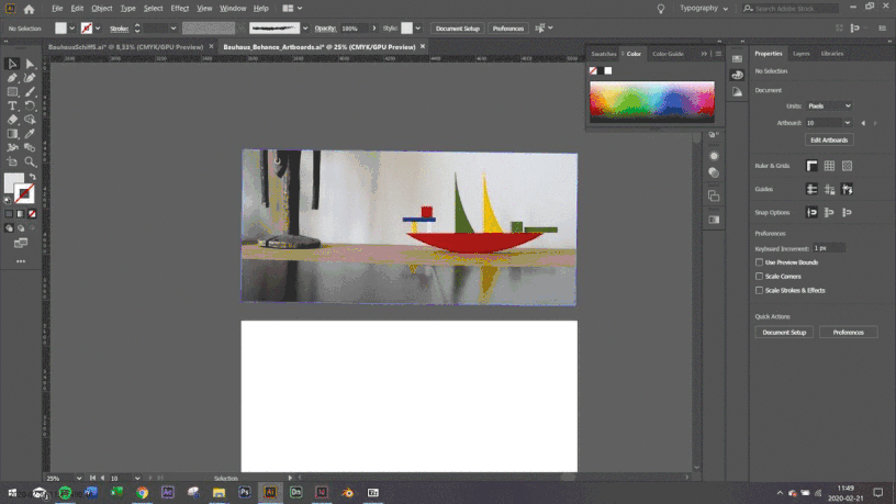
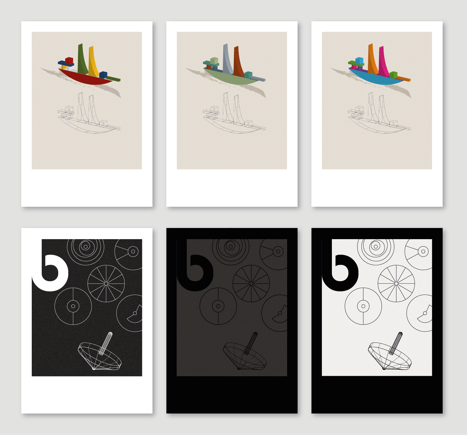
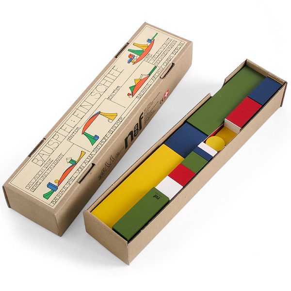
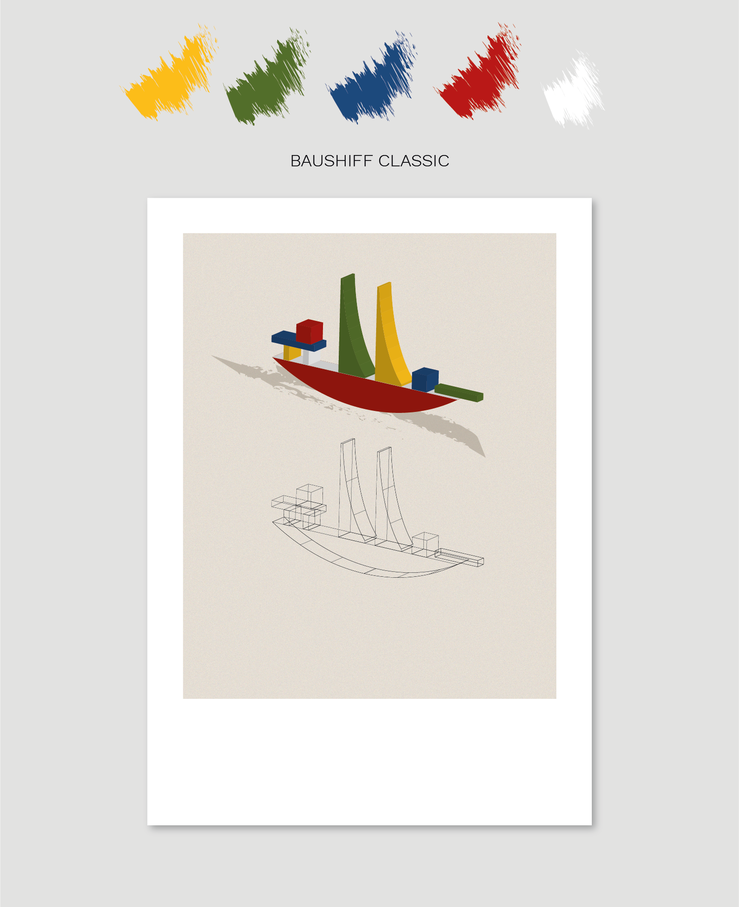
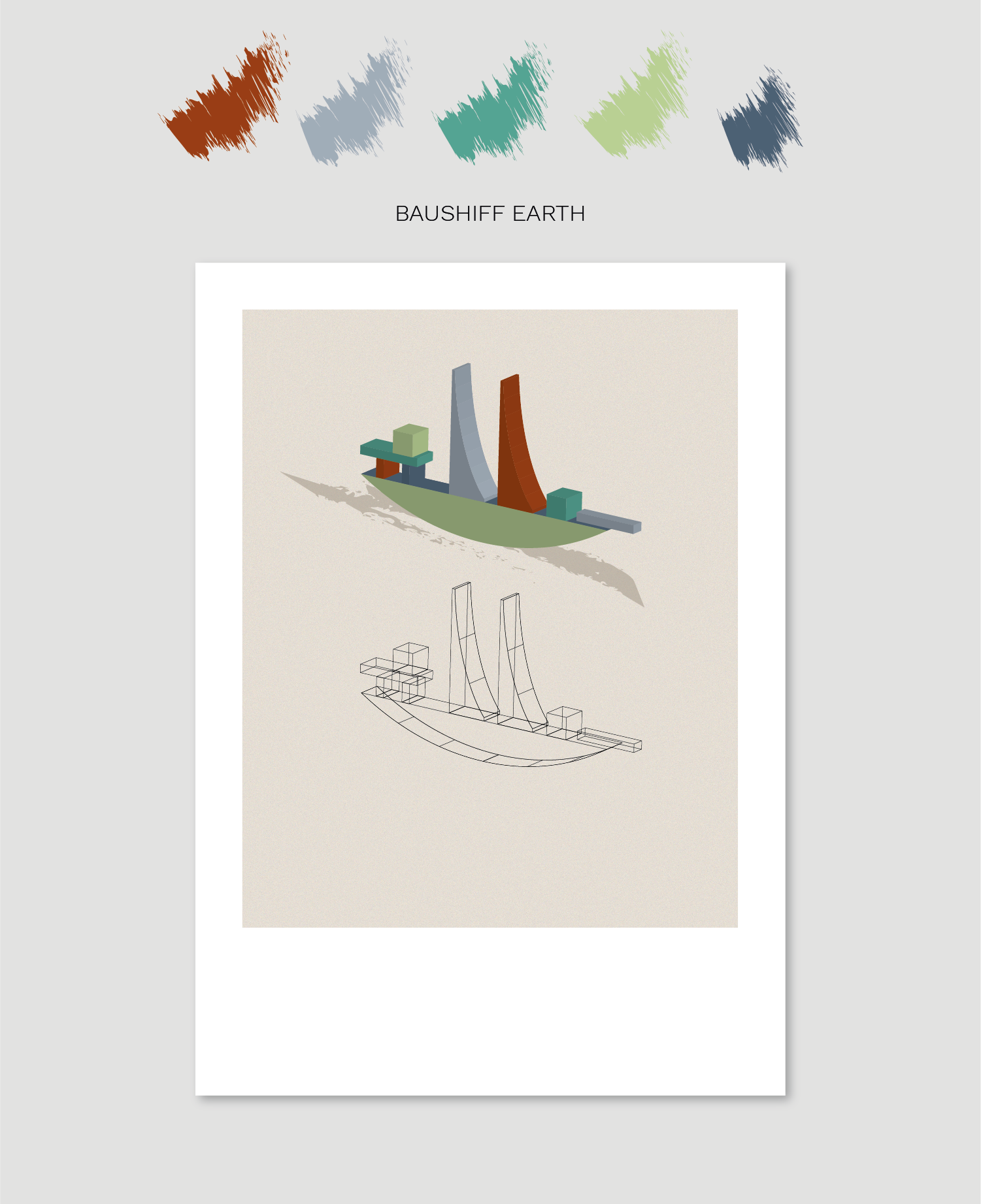
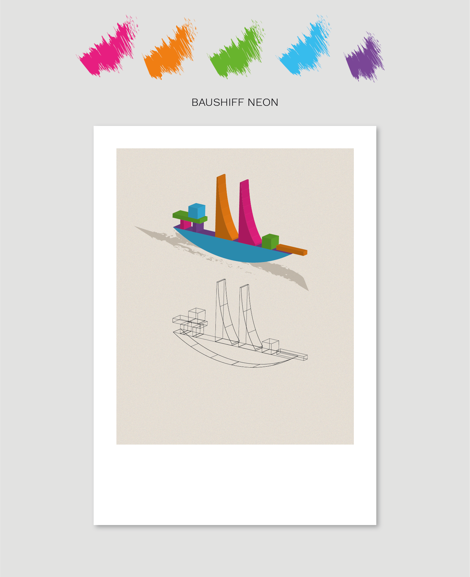
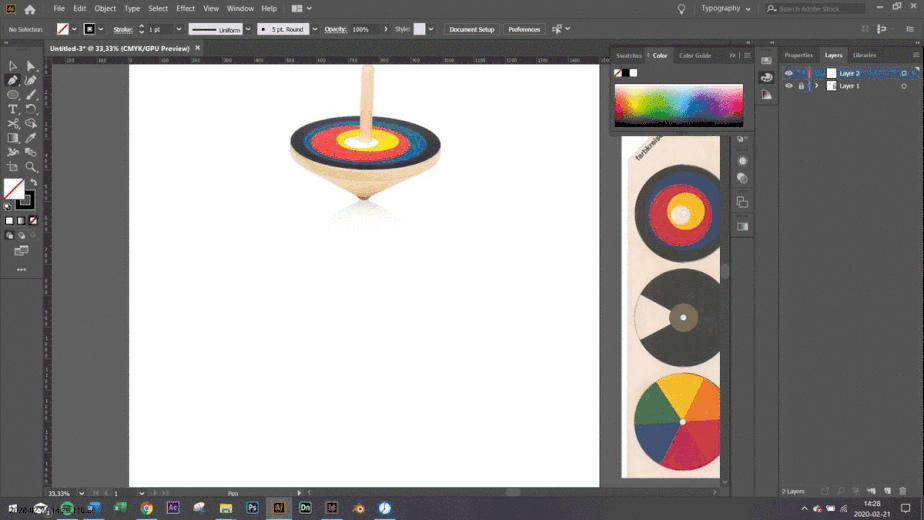
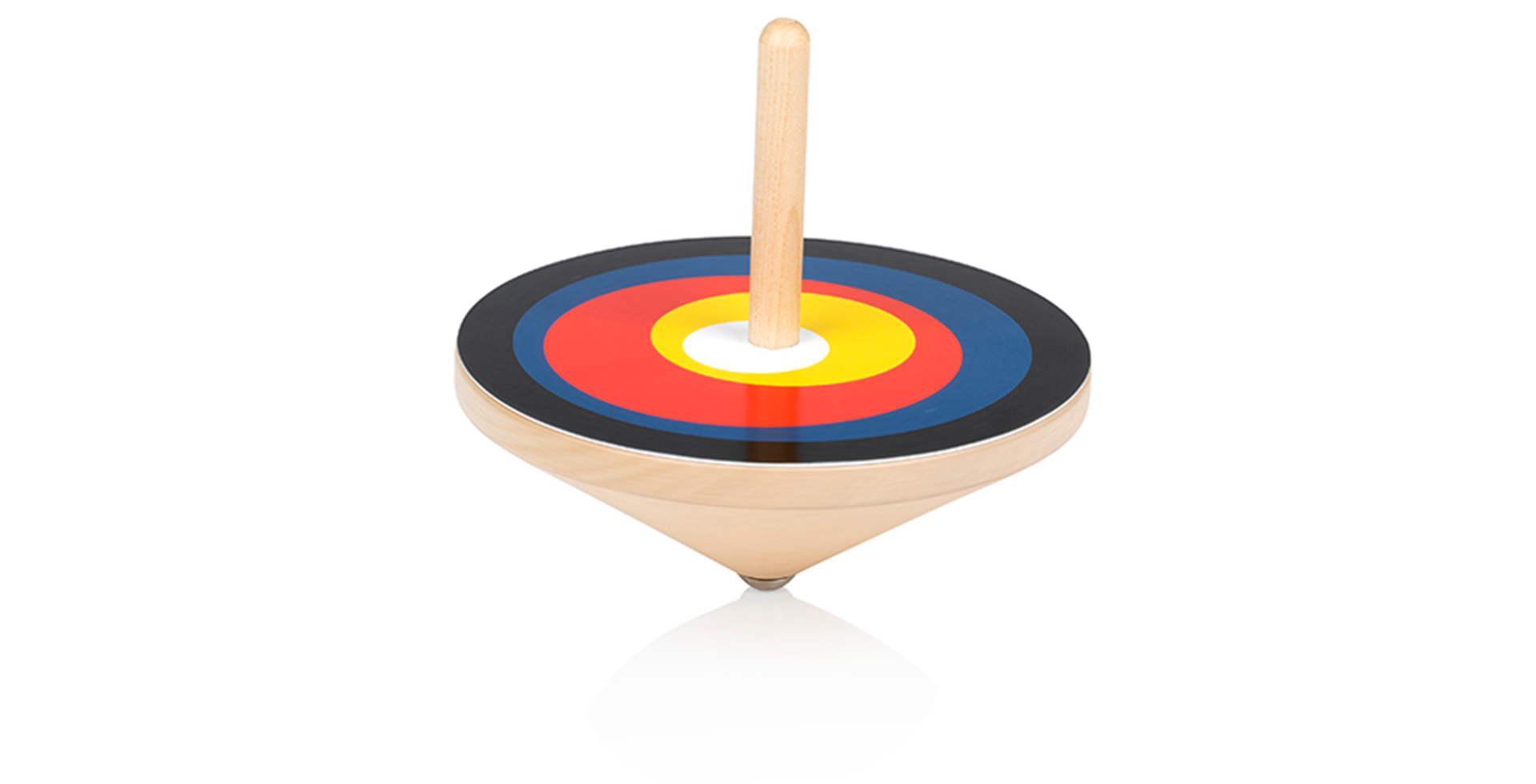
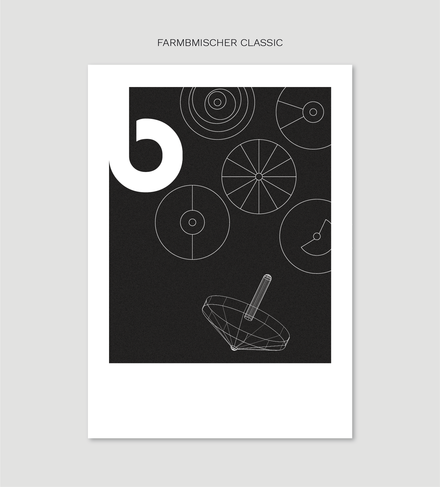
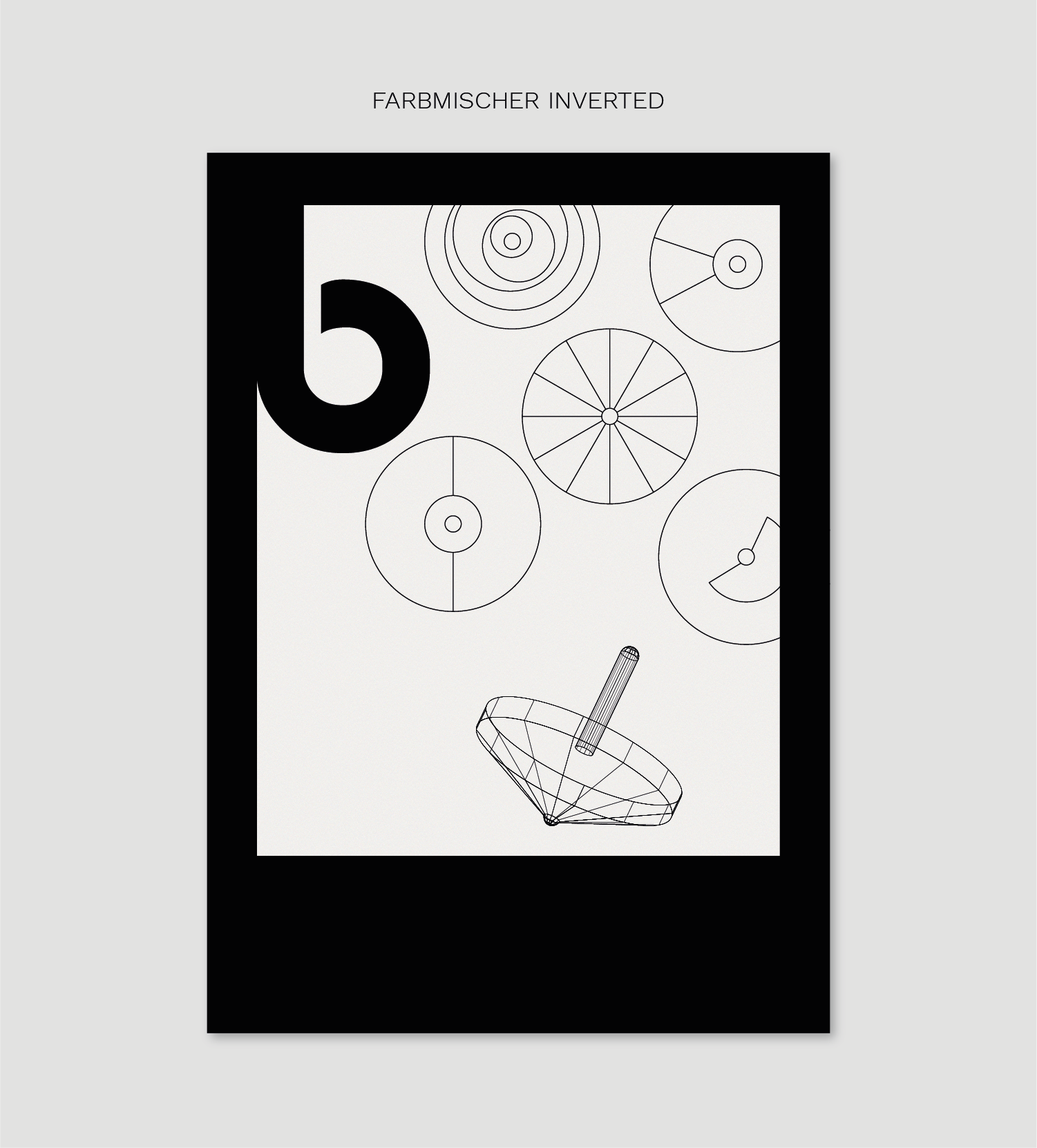
The exhibition was lovely and inspiring. And although I love the Bauhaus furniture, I myself own Cesca chairs, I found the toys simple and elegant. Therefore I designed toy-themed posters with focus on the classic building blocks (Bauspiel: Ein Schiff) and the optical colour-blender (Optischer Farbmischer). I played around with the 3D-effect in Illustrator, and used both filled shapes as well as wireframes to design my posters.
BAUSHIFF
It was obvious to use the basic colours from the Bauspiel building blocks, but – to make it more fun – I played around with bright neon colours as well as earthy tones for a more subtle approach. Down below you can see the different shapes needed to make the ship 3D.

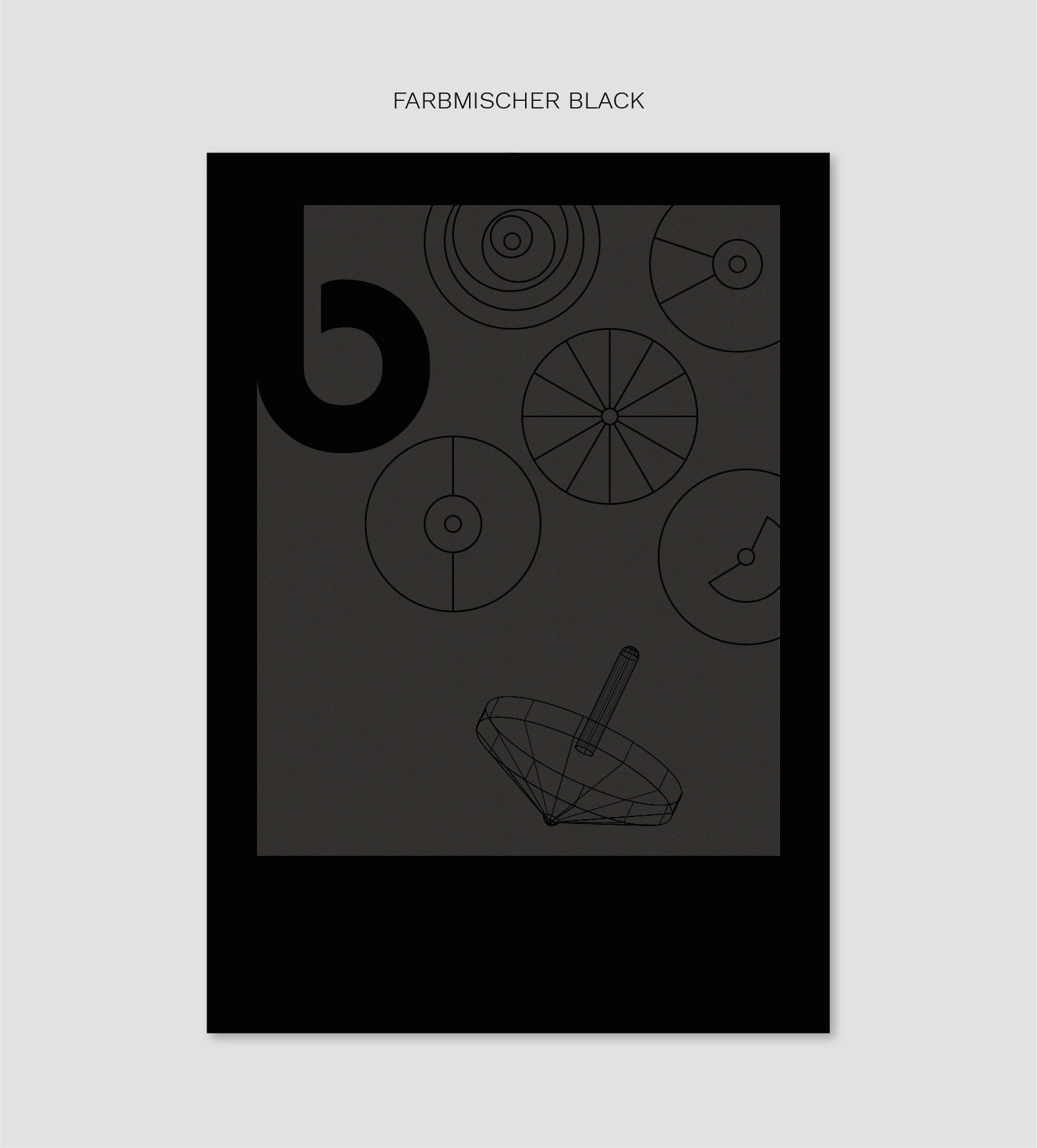
FARBMISCHER
The classic colour-blender-spinner-thing is a wooden spinning top, upon you put layers of CD-shaped colour combinations. The challenge here was to take something very colourful, and redesign it in black-and-white – keeping the feeling and recognition alive.
Thank you for watching!